Here’s how I go about my work:
 It all starts with ideas. Lots of ideas. Lots of nasty little thumbnail sketches about 1-2 inches high. I like to sit on the couch in my studio with a pencil and paper for this stage. There’s something more fluid about actually drawing and hearing the scratch of pencil on paper that just isn’t the same drawing digitally. I work out a bunch of ideas, the sight angles (where the viewer is standing in relation to the scene) and composition at this stage.
 Once I have an idea and a composition that seems to work, I scan it into Photoshop and enlarge it. I gather reference photos or images to help define details, clothing folds or just because I like the lighting or color palette. I’m careful about copyright issues and shoot many of my own reference shots. If I use outside sources I use pieces from multiple sources or a photo as inspiration for the illustration.
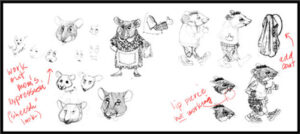
Then I start drawing the details either on tracing paper or digitally. I use Photoshop and/or Painter for this. I like Painter’s pencils better – for now.
Usually, each piece of an illustration is on a separate layer so I can independently resize and move stuff around to (hopefully) improve the illustration. Generally, this stage takes me a few hours to a day. Some of my very complex drawings may take a few days to draw.
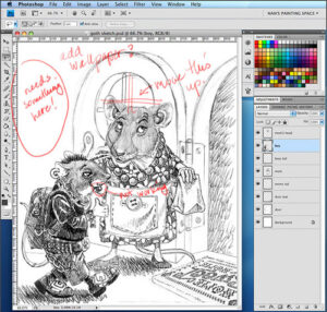
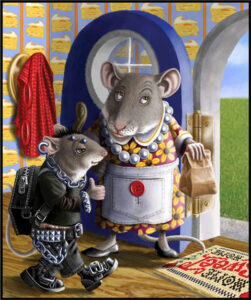
Sometimes I do a value study and digitally paint in the lights and darks to get a better sense of lighting. I rarely do color studies because it feels like I’m painting the same thing twice. Besides, I can always change things since I work digitally. With “undo” commands and multiple versions of a painting, I can try all kinds of combinations. In this painting, I changed the color of Mom’s dress a few times. I find that painting digitally has made me more fearless in trying dramatic changes.
I layer and build up the color to achieve the right intensity and rich transparency. In traditional painting, I use watercolor, even though it looks like oil. I also paint the same way digitally: building up the color gradually with transparent layers. (The apron has five transparent colors to create the shadows).
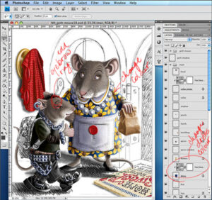
I paint and complete one section at a time (even when I paint traditionally), I always work this way. It establishes the depth of highlights and shadows for the rest of the painting.
I also make a point to draw the edges of shapes with customized brushes so there aren’t any “digitally precise” edges. (Look at the edges of the door and how this resembles colored pencil). My objective is to achieve those imperfections that occur in traditional painting and NOT to look like a slick digital creation.
This painting took about three days from start to finish.
However…
It’s bound to happen. At some point in all our careers, a client asks us to create something we dislike. If we’re lucky, it takes only a few days or weeks of misery to complete, before we can slink away in shame. The saving grace is that no one needs to know WE created this banal, cliché, awful thing. Here is my story…
Creating the “Ruff, Ruff, Hot Stuff” dog: (the passage of time and geographic distance means the chances of the Client seeing this are minuscule – NEVER offend a Client)
 An ad agency approached me about creating a Dalmatian spokesdog (a mascot kinda thing) for a very large company. Initially, it sounded great, until I heard the dog says things like: “Ruff, ruff, this deal’s hot stuff!” Literally. Trying to take the graceful way out, without a bold-faced refusal, I decided to price the job so astronomically high they would NEVER agree, and I’d be off the hook.
…They said: “great!”
When I say high, I mean the outrageous equivalent of $700 per HOUR for my pain and suffering. Where do I sign…
For the next few weeks, I became the ruff-ruff-hot-stuff girl, though he also says: “Spot the deal!” Shudder.
I sketched out edgy and hip versions of this Dalmatian dog; I did realistic, dull versions, to be sure I covered all the options. Out of at least 10 versions, some of which were actually likable, they naturally picked the one I absolutely detested. So then I had the great pleasure of rendering half-a-dozen final versions of the dullest dog I could imagine, of which the most dynamic version was him walking in profile (none of that rebellious foreshortening here). I kind of didn’t care because they were paying me like a bandit, and it’s not like this was EVER going to see daylight in MY portfolio. No one would ever know I did it. I would still do the best work I could (I am a Professional after all), and the Client would love it and be super-happy. I quickly tried to distance myself from the cringe-worthy pooch and purge the hokey dialog whenever it looped in my brain. I cashed the check, took a deep breath and moved on.
Several months later, the ad agency calls… “We have great news! The spokesdog is on the cover of Marketing Magazine (a National Canadian publication), and we made sure they included YOUR name.” Thank you for that. Bitten in the butt by the Ruff, Ruff, Hot Stuff dog…and the humiliation was complete.
Take away lesson: we aren’t always going to love the projects we work on. If we’re lucky, we’ll LIKE most of them. When we have to do work we dislike, it can’t be rushed through and shoved aside; we still need to give it 110% of our efforts because we’re professionals and committed to doing it. Even when it pays a ton, it’s hard to be motivated to do the best possible job on something that makes us shudder.
A lot of the work I create never makes it into my portfolio or website, not because it’s awful and I hate it, but because it had to meet very specific criteria and I wouldn’t take it in a different direction that wouldn’t suit the client; that’s what PERSONAL WORK is for. I can live with it. I still have my process, and I get to draw and paint every day for a living.
