Last month, Kirill Tokarev sat down with USV student Will Koehler about his stylized experiments with Unreal Engine 4. This post originally appeared on 80.lv. In this breakdown, Koehler talked about the composition, the choice of shaders, the work with the lighting and other little bits of the production. The 3d environment is inspired by ‘The Frozen Pass’, created by Daniel Conway.
Introduction
Hey! My name is Will Koehler, I’m 21, finishing a bachelor of arts at University of Silicon Valley in San Jose, California. I love creating environments and tend to do small props and accessories in between to keep things fresh. I work mostly with physically based materials, but I aim for a more stylized feel. Project-wise, I’ve interned at Sony San Diego, working on MLB: The Show ‘17 and I’ve had my fair share of indie projects that haven’t seen the light of day. I also make items for Warframe’s steam workshop. These past couple months I’ve been working on “The Frozen Pass”.
The Frozen Pass
Most of my portfolio work starts the same way, days of surfing Pinterest and ArtStation looking for concepts that tick all the right boxes. This can, in a way, be the most important part of the process.
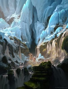
I’ve found that if you jump into creating the first pretty concept you find, you may just be setting yourself up for a very long frustrating failure. I’m always considering the scope of a piece, how many unique materials and objects I would have to create. I also deliberately seek subjects that I can learn the most from.
So when I eventually came across this concept ‘The Frozen Pass’ by Daniel Conway, not only was it gorgeous, it hit all those marks. I really dig Dan’s style and I still have a lot to learn from it. This concept gave me an opportunity to learn organic shapes, lush moss, convincing water, interesting ice, particles, atmosphere, lighting. All in a manageable scope, but still breathtaking.
Planning
The planning process was pretty standard. I categorize all the objects into “Unique” and “Duplicate” objects. Internally I also note the best way to handle the materials. I used a lot of world-aligned tiling materials to keep scale consistent and help blend between meshes.
 Some objects, like the rocks and ice, also use a “macro-normal” for larger scale detail beyond what is provided by the material. This way I can use the same blend material for many objects and just plug in the appropriate normal map to the material instance. I go into detail on that later.
This can save you a lot of time if you have it planned out beforehand.
I started my block-in with Blender and moved to UE4. In both programs I carefully align the camera, reference, and subject, and make sure my FoV is consistent between the two programs cameras. This is essential to duplicating the original composition of the piece. Really put in the time here to get it right, cause it’s a pain to try to fix later.
Assets
Asset production is pretty straightforward. First I figure out how many variations I may need, be it of rocks, ice etc. For most things I do 3-4 variations. I try to make every object as reusable as possible by making each angle different, but not so unique that you’d easily spot the duplicate in the scene. Here’s all the objects I used to populate the scene.
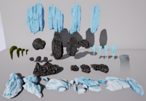
I block in the main forms with Blender then take it to ZBrushfor detailing. Here I’ve developed a set of brushes to help me detail faster and more consistently. I also use some brushes from Michael Vicente and Jonas Ronnegard that really help get a planar stylized feel. After a Zremesh it’s back to Blender for decimation and UV unwrapping. I bake everything in Substance Painter, for some assets I’m only baking the normal map.
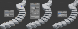
I’ve picked up a nice method of generating meshes using displacement and decimation. This next part I do in blender, but can be done in most modeling programs. Using the height map from Zbrush I apply it as displacement to a simple UV’d and subdivided mesh. You can move the UV shells around to vary up how the texture is mapped to the mesh. After I apply my modifiers I use a decimation modifier to create a low poly version.
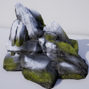
Once it’s in engine just make sure the tiling of your material matches up. This is great for organic forms. You can use this to generate a ton of semi-unique meshes for your scene.
Materials
For this project I put together a pretty heavy master material that blends between stone, water, moss, and snow.
I’ll break down the node network, but here’s a general overview:
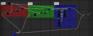
All of my materials are contained in material functions. First I blend the snow over the base rock material using a “MatLayerBlend_StandardWithDisplacement” node. Make sure to plug in your normal map parameter to “World_Aligned_Blend” and use the “w/ Explicit Normal” output for the alpha mix.
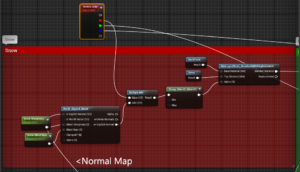
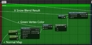
I do the exact same thing for moss, except now using the green vertex color for the alpha mix and the result of the last blend for the base of this blend.
The water blend is a little different, we just want the normals and roughness to overpower the base material. There may be a cleaner way of doing this, but this was the straightforward approach I did. First I break open the result of our previous blend and the water material. I pass every applicable attribute over except roughness and normal, which I pull from the water. The result is the previous blend with water running over it, but we only want it where we paint blue, so we blend between the ‘wet’ and ‘dry’ versions using the blue vertex as alpha.
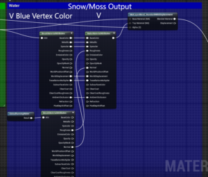
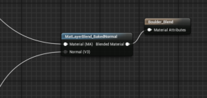
Finally we need to pass our material through this “Baked_Normal” blend with our normal map parameter. This is gunna allow us to use our world aligned materials, but still use different normal maps on a per-instance basis.
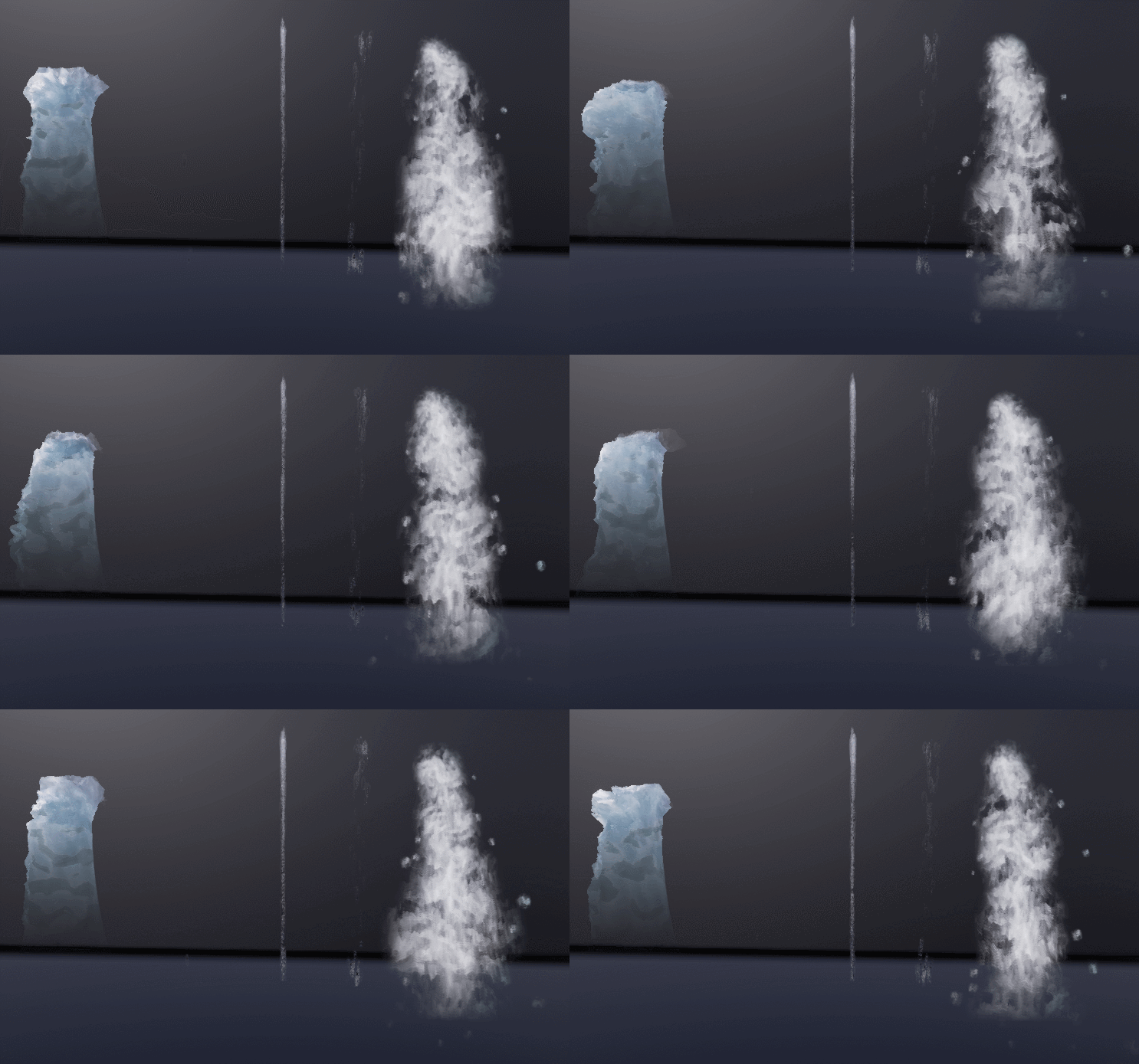
Water has been a huge part of this endeavour. I’ve put a lot of time into making various forms of water for different uses. For waterfalls I have a piece of geometry with panning textures and displacement. Additionally some of the larger waterfalls have a misty particle effect. I also have 3 particle effects for drips. These are a nice little detail.
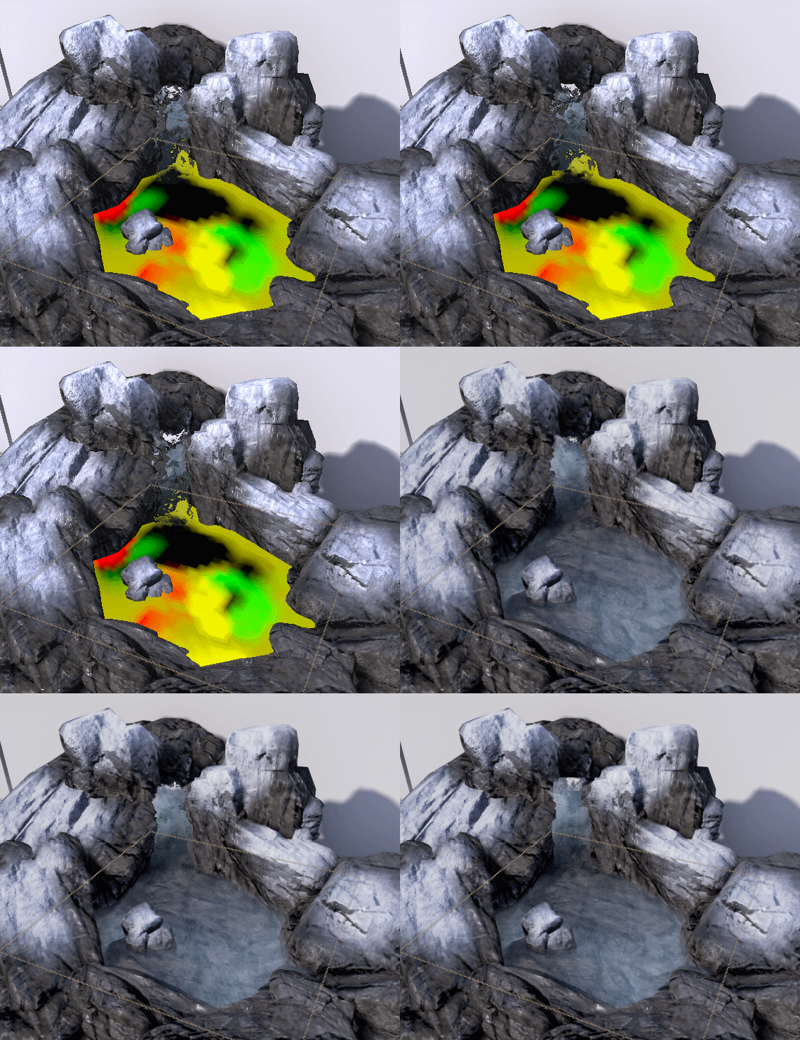
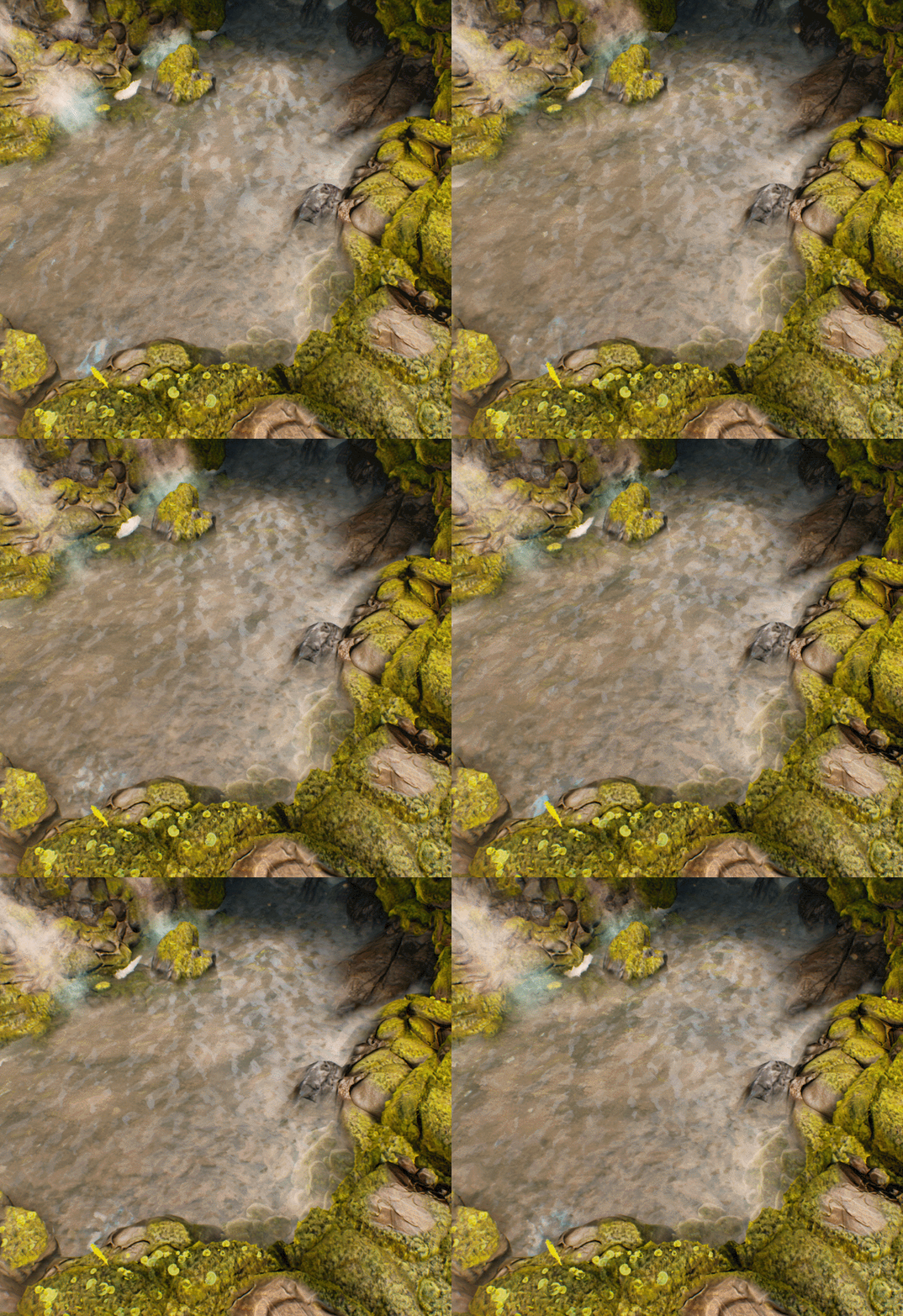
 The ponds with deep flowing waters were tough. I didn’t really like the current methods of generating flow maps so I resolved to create a re-usable in-engine method for painting flow maps. It works by combining the Green and Red channel of the Vertex Color into a vector map.
This wasn’t easy, and it’s not the most intuitive thing to use, but it works great for my case. Here’s my setup:
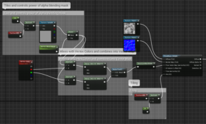
Important! Within the “ConstantBias Scale Node” set the “Bias” to -0.5 and “Scale” to 1.
This all plugs to the diffuse attribute. You can also do this without the blending mask multiplied with the vertex colors, but there will be very noticeable stretching. I just re-use my diffuse water texture for the blending alpha. Now before you start painting you need to set up a very specific palette. This is the “language” of flow maps.
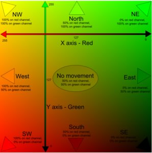
Red and Green are the only colors we will be mixing. Set the RGB values manually, then drag the color to the top to save it to your palette. I tend to just use 4 directions and the neutral color.
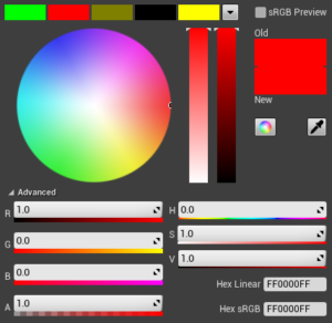
It’s going to take some trial and error to figure out which colors correlate to what flow direction, but once you get the hang of it you can get some pretty good results fast. I suggest painting at low strengths with high fall-off to avoid too much distortion.
The Moss and The Ice
I get a lot of questions about the moss. It’s been a fun learning process.
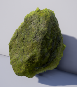
One of the big advances for me was using ‘AOO’. ‘Ambient Occlusion Occlusion’ or ‘AO Fresnel’ is a little trick I picked up from page 38 of Naughty Dogs Technical Art Documentand it’s so simple you’ll wonder why you didn’t think of it first.
It’s a nice little marriage of two concepts most are already familiar with. Simply put, you use Fresnel to occlude the effects of your Ambient Occlusion map as faces angle further away from the camera. It looks something like this in UE4.
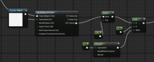
You can ignore the world-aligned and power nodes, they were only necessary to my case, the important part is to Lerp between your AO map and 1, using fresnel as a mask. The result is plugged to the AO attribute in the material, but I’ve plugged it straight to preview so you can get a clearer sense of the result.
Why? Well AO falls into the deep cracks of rocks and thick moss, but you see less and less into these parts as they face away from you because they are occluded by the surrounding ridges. It’s like cheap Parallax Occlusion. This combined with the “Fuzzy Shading” node for the Diffuse has made some great results!
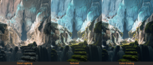
As for the ice, it has a very nice subsurface glow in the concept and I went as far as I could to replicate it using just my light and the subsurface shader, but ultimately it needed some nudging to get that nice blue glow. My solution was to manually vertex paint in a blue emissive color, using Ambient Occlusion to mask out the crevices. I use this conservatively on thinner bits of ice where light would bounce through. You can see this in the “Detail Lighting” image I’ve shared at the end.
Realistic and Stylized Look
The balance of stylized and realistic aspects in the concept art is one of the reasons I was drawn to it so much. It has a painted feel, but very explicit detail in some areas. So from the beginning I’ve been struggling with this and figuring out how to hit that sweet spot. I think the best way to describe the approach is that I try to keep the materials as true to life as possible (in terms of their PBR values) and let the style come out in how I simplify the primary and secondary forms. Once I get down to the little details I revert back to a more realistic feel. It has impact at a distance, and interest up close. I think as realistic materials become more abundant it’s gunna be more important than ever for us to create interesting styles, moods, and compositions.
Lighting
The lighting is actually very simple. From the concept I could tell the light was limited to one large beam coming in at an angle through some clouds, or maybe a cave opening? It’s almost like a spotlight, but I needed parallel sun-like rays. So my compromise was to use a simple directional light, but place the scene in a bubble with a gap in it. So there’s this interaction of light that gives a sense of a world beyond the frame. I make that one light go as far as possible by tweaking the angle, intensity, and temperature for hours. Beyond that, there’s a point-light that concentrates some warmth at the center of focus by the cave opening and a tiny touch of HDR environment lighting that really brings out the detail in the ice. Finally there’s a touch of LUT table color grading to push the darks, and make the colors pop a bit.
